Raw numbers in a spreadsheet do not grab attention. A graph does. When you know how to make a graph in Google Sheets, you can turn any dataset into a clear visual that people actually understand.
Whether you are tracking monthly sales, comparing team performance, or presenting survey results, a graph tells the story faster than rows and columns ever will.
Google Sheets makes the process simple. Select your data, click Insert, choose Chart, and your graph appears in seconds. From there, choose the right chart type, adjust colors and labels, and you are done.
This guide walks you through the full process step by step.
You will learn how to:
- Set up your data correctly
- Insert a graph
- Choose the right chart type
- Customize it for a clean, professional look
- Fix messy data before graphing
Setting Up Your Data for a Graph
A graph is only as good as the data behind it. If your spreadsheet is messy, your graph will be too. Before clicking Insert, take a minute to check your layout.
Keep it simple:
- Put labels in column A
- Put numbers in the columns next to it
- Use clear headers in the first row
Google Sheets uses those headers for axis labels and legends, so name them clearly.
Here is what a clean dataset looks like:
Common Problems to Fix First:
- Blank rows or columns in the middle of your data. Google Sheets may misread the data range, creating gaps or missing values.
- Numbers stored as text. If a cell shows "$1,500" or "~2500 units" instead of a plain number, the chart cannot interpret it properly. Highlight the column, go to Format > Number, and choose the correct format.
- Missing headers. Without headers, Google Sheets guesses what your data means. It usually guesses wrong.
- Inconsistent labels. If one row says "US" and another says "United States," your graph will treat them as separate categories.
Fix these first and your graph will work correctly on the first try. Skip this step and you will spend twice as long trying to figure out why your graph looks broken.
Your data is ready. Now let's turn it into a graph. The whole process takes about 30 seconds.
Inserting the Graph in Google Sheets
Step 1: Select your data
Click cell A1 and drag to highlight your entire dataset, including headers.
If your data runs from A1 to C7, select that full range.
Quick tip: Do not skip headers. Otherwise, your graph will show "Series 1" and "Series 2" instead of meaningful names like "Revenue" and "Expenses."
Step 2: Insert a chart
Go to the top menu and click Insert > Chart. Google Sheets drops a default graph onto your sheet and opens the chart editor panel on the right side.
The default type is usually a column graph or a line graph. Google Sheets picks whatever it thinks fits your data best. Sometimes it gets it right. Sometimes it does not. Either way, you can change it in the next step.
Step 3: Pick your chart type
In the Chart Editor under the Setup tab, open the Chart type dropdown.
You will see options like:
- Line chart
- Column chart
- Bar chart
- Pie chart
- Area chart
- Scatter chart
Click on any option and the graph on your sheet updates instantly. Try a few to see which one fits your data best.
Step 4: Move and resize
Click the chart once to select it. Drag it anywhere on your sheet.
Use the blue corner handles to resize.
To place the chart on its own sheet, click the three-dot menu in the top-right corner of the chart and select Move to own sheet. This gives it a full-screen view which works great for presentations.
Choosing the Right Graph Type
Google Sheets offers over 20 chart types. You only need a few.
Here are the five you will actually use, when to pick each one, and how to create them.
Data Scenario | Best Chart Type |
|---|---|
Trends over time (monthly sales, website traffic) | Line Graph |
Comparing categories with short labels | Column Graph |
Comparing categories with long labels | Bar Graph |
Parts of a whole (market share, budget breakdown) | Pie Graph |
Volume or magnitude over time | Area Graph |
Relationship between two variables | Scatter Graph |
Line Graph
Use a line graph when your data changes over time.
Best for trends over time such as monthly sales, weekly signups, or daily traffic. If your X-axis represents dates or time periods, this is your best option.
How to create it: Select your data, go to Insert > Chart. In the chart editor, open the Chart type dropdown and select Line chart. Google Sheets will plot your time periods on the X-axis and your values on the Y-axis automatically.
Column Graph
Use a column graph when you want to compare categories side by side.
Sales by region, product performance, team output. The vertical bars make differences easy to spot at a glance.
How to create it: Follow the same steps. In the Chart type dropdown, select Column chart. Each category gets its own vertical bar.
Bar Graph
A bar graph does the same job as a column graph but runs horizontally.
Use it when your category labels are long. "North America," "Southeast Asia," "Central Europe" read much better on a horizontal axis than squished under vertical bars.
How to create it: Same process. Pick Bar chart from the dropdown. Categories appear on the Y-axis and values on the X-axis.
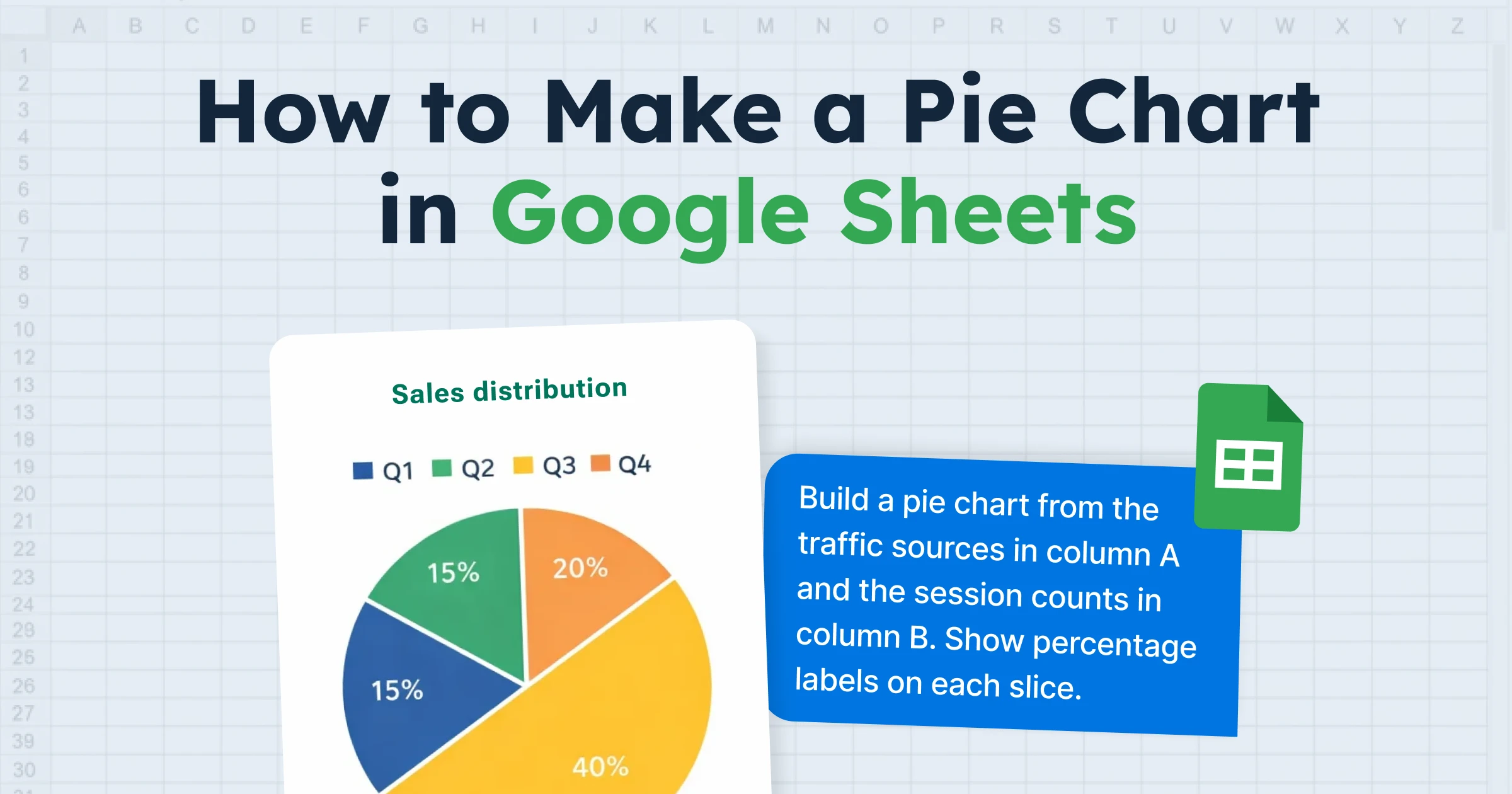
Pie Chart
Use a pie chart when you want to show how parts make up a whole. Market share, budget breakdown, survey responses.
One rule: keep it to five or six slices max. More than that and it becomes unreadable. If you have too many categories, switch to a bar graph instead.
How to create it: Select one column of labels and one column of values, then go to Insert > Chart and pick Pie chart. Google Sheets will calculate the percentages for you.
Area Graph
Think of an area graph as a line graph with color filled underneath the line.
It highlights the size of change over time. Useful when you compare two or three series and want to show how much space each one takes up.
How to create it: Same steps as a line graph. Just pick the Area chart from the dropdown instead. The graph will look like a line graph but with shaded regions below each line.
Scatter Graph
Best for showing relationships between two numeric variables.
Ad spend vs. conversions, hours studied vs. test scores, price vs. demand. The dots on the grid reveal patterns, clusters, or correlations in your data.
How to create it: Select two columns of numeric data, go to Insert > Chart, and pick Scatter chart. Each row becomes a dot on the graph. Add a trendline under Customize > Series to show the overall direction.
If you are not sure which one to pick, start with a line graph for time-based data and a column graph for everything else. You can always switch later in the chart editor.
Customizing Your Graph in the Chart Editor
The default graph gets the job done but it looks generic. A few minutes in the chart editor fixes that. A few minutes in the chart editor makes it look like you actually put effort in.
Double-click your chart to open the chart editor panel.
Click the Customize tab at the top. This is where all the visual controls live.
Chart Style
Change background color, border color, and font.
Two helpful options:
- Smooth lines for curved line charts
- Maximize to reduce extra white space around the chart so it fills the frame better.
Chart and axis titles
Click Chart & axis titles in the Customize panel.
Use the Type dropdown to switch between chart title, subtitle, horizontal axis title, and vertical axis title.
Use short, direct titles. "Monthly Revenue 2025" works. "A Chart Showing Our Company's Monthly Revenue Numbers for the Year 2025" does not.
Legend
Control where the legend sits: top, bottom, left, right, or completely hidden. If your graph only has one data series, hide the legend. It adds clutter without adding information.
Series
This is where you change colors for individual data series. You can also turn on data labels to show exact values on each bar or data point. And you can add a trendline to line and scatter charts which draws a straight or curved line showing the overall direction of your data.
Gridlines
Add or remove horizontal and vertical gridlines.
More gridlines make exact values easier to read. Fewer gridlines make the chart look cleaner. Pick what works for your audience.
Here is a quick checklist before you call your graph done:
- Add a clear chart title
- Label both axes
- Pick colors that are easy to tell apart
- Remove the legend if you only have one data series
- Add data labels if your audience needs exact numbers
- Remove unnecessary gridlines for a cleaner look
GPT for Sheets – The AI Agent That Creates Charts for You
What if you never had to clean your data or build your chart manually?
If your sheet contains entries like "About $1,200," "~2500 units," or "Approx 800," you cannot graph that directly. Or maybe you have hundreds of feedback responses that need to be categorized before they make sense in a chart. Normally you would clean the data first, then build the graph yourself.
GPT for Sheets by GPT for Work skips all of that. It is a full AI agent that works directly inside Google Sheets. Tell it what you want in plain language and it handles the entire workflow. It cleans the data, prepares it, and creates the chart for you.
One prompt. Done.
Example prompt: "Clean the numbers out of the messy text entries, standardize the country labels, and create a chart"
But charting is just one thing it can do. GPT for Sheets is a full AI agent built for bulk spreadsheet tasks. Generate content, translate, categorize, clean data, search the web, analyze images, write formulas, and more. All from a simple prompt.
If the task lives in a spreadsheet, GPT for Work can handle it.
Conclusion
You now know how to make a graph in Google Sheets from start to finish.
Start with clean data, choose the right graph type for your scenario, and spend a minute in the chart editor to make it look sharp.
Bookmark the chart type table above as a quick reference.
Or skip the manual work entirely. GPT for Work is an AI extension for Google Sheets that handles everything from data cleanup to chart creation to any spreadsheet task you can describe. Just type what you need.
FAQs
What is the difference between a chart and a graph in Google Sheets?
There is no difference. Google Sheets calls them charts, but most people say graphs. They mean the same thing.
Can I make a graph on the Google Sheets mobile app?
Yes. Select your data, tap the + button, and tap Chart. You get fewer customization options compared to desktop but it works.
How do I add new data to an existing graph?
Double-click the graph, open the Setup tab, and expand the Data range to include the new rows or columns.
Why does my graph look wrong?
Check for blank rows, numbers stored as text, or missing headers. These three things cause most graphing issues in Google Sheets.
Can I use AI to clean and chart my data?
Yes. Tools like GPT for Sheets can automate the cleaning process and help generate charts based on natural language prompts.